Nelson Pereira
Bárbara Barcelos
Beatriz Teotônio
Renato Coelho
The transformation of the Dia a Dia: Branding Strategy and Premium Positioning in Cash and Carry Retail.
Challenge
Challenging positioning in the cash and carry market.
Dia a Dia, operating in the cash and carry sector, faced a challenging competitive scenario, with a high market concentration in the hands of large players.
The brand already stood out for its low cost, but it needed to refine its positioning, standing out not only for its competitive price, but also for the quality and variety of its products.
The cash and carry market, even more saturated, demanded innovation and a clear repositioning, especially with the search for a premium wholesale model that was affordable and convenient.
Dia a Dia (Day to Day) needed to be seen as a practical and quality option, combining the benefits of wholesale with the experience of a premium supermarket.
Solution
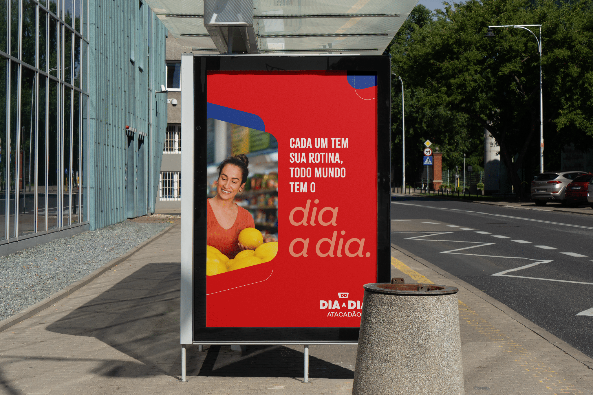
Connect with everyday life: how the new identity made a difference in everyday life.
The value proposition of Everyday Life has been redefined to align with the promise of convenience and accessibility.
The brand started to deliver a complete experience to the consumer, with a renewed visual and verbal identity, focusing on competitive price, variety and convenience.
The essence of the brand was expanded, incorporating the concept of premium quality to the traditional cash and carry model.
The focus was on feeding routines, being the point of sale that delivers not only an affordable price, but also a shopping experience that engages customers with healthy products, charming service, and well-organized stores.
The emotional connection was amplified with an optimistic verbal language, which made everyday shopping a pleasurable and fun experience, and not just a business transaction.
The branding strategy aligned directly with increasing the customer experience, making each visit unique and personalized.
Result
From strategy to impact: how strategic rebrandings transform the market.
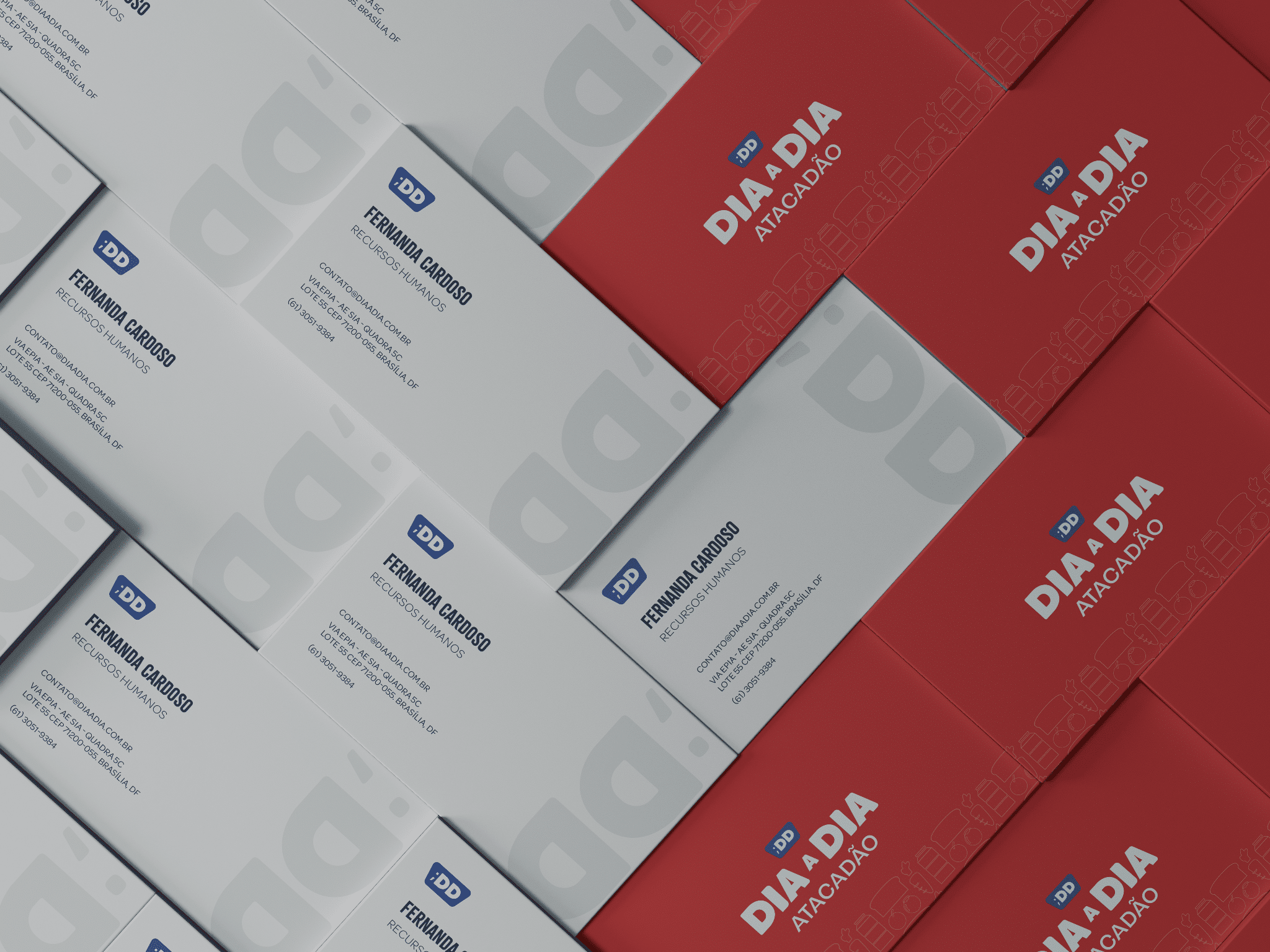
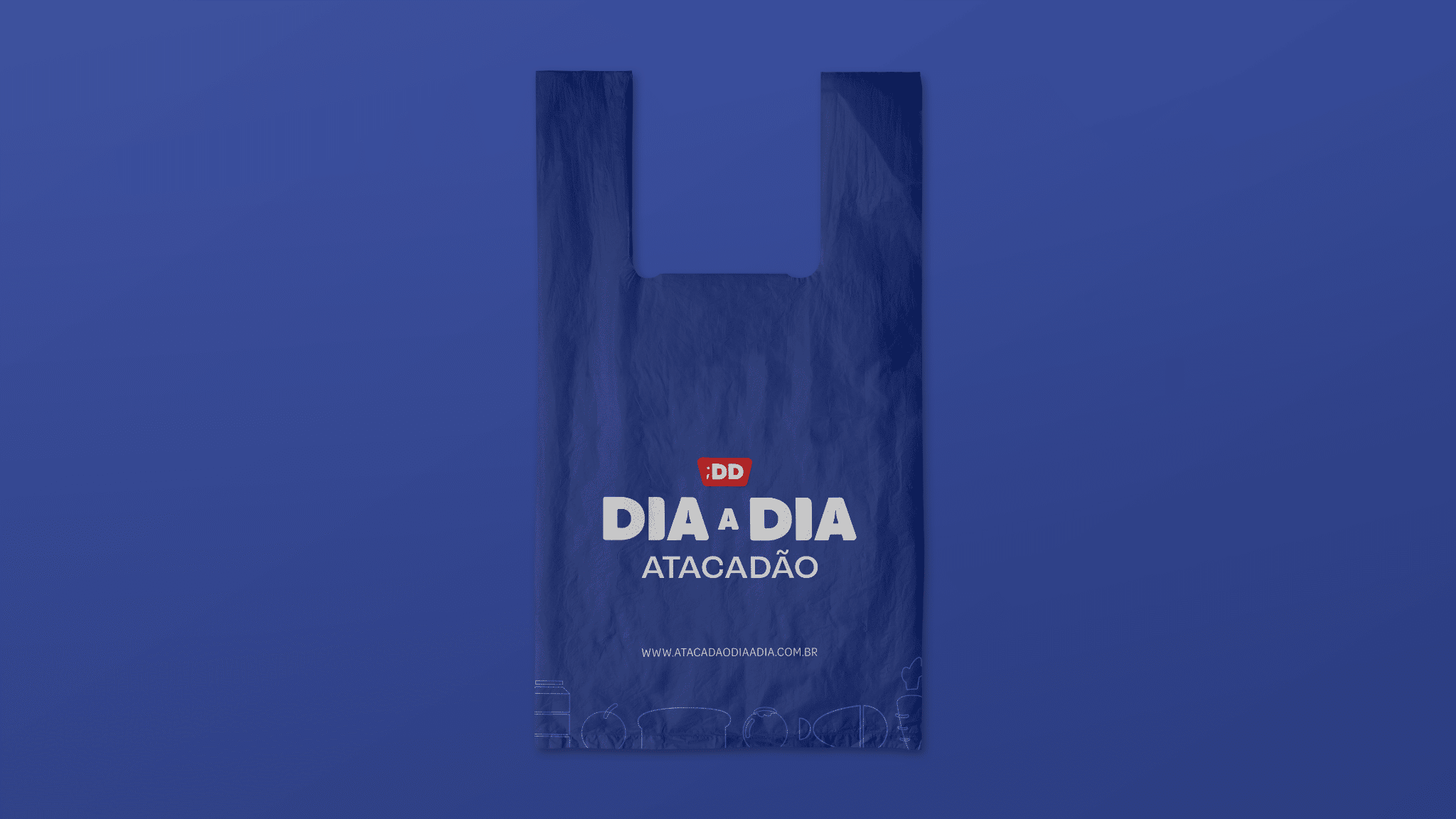
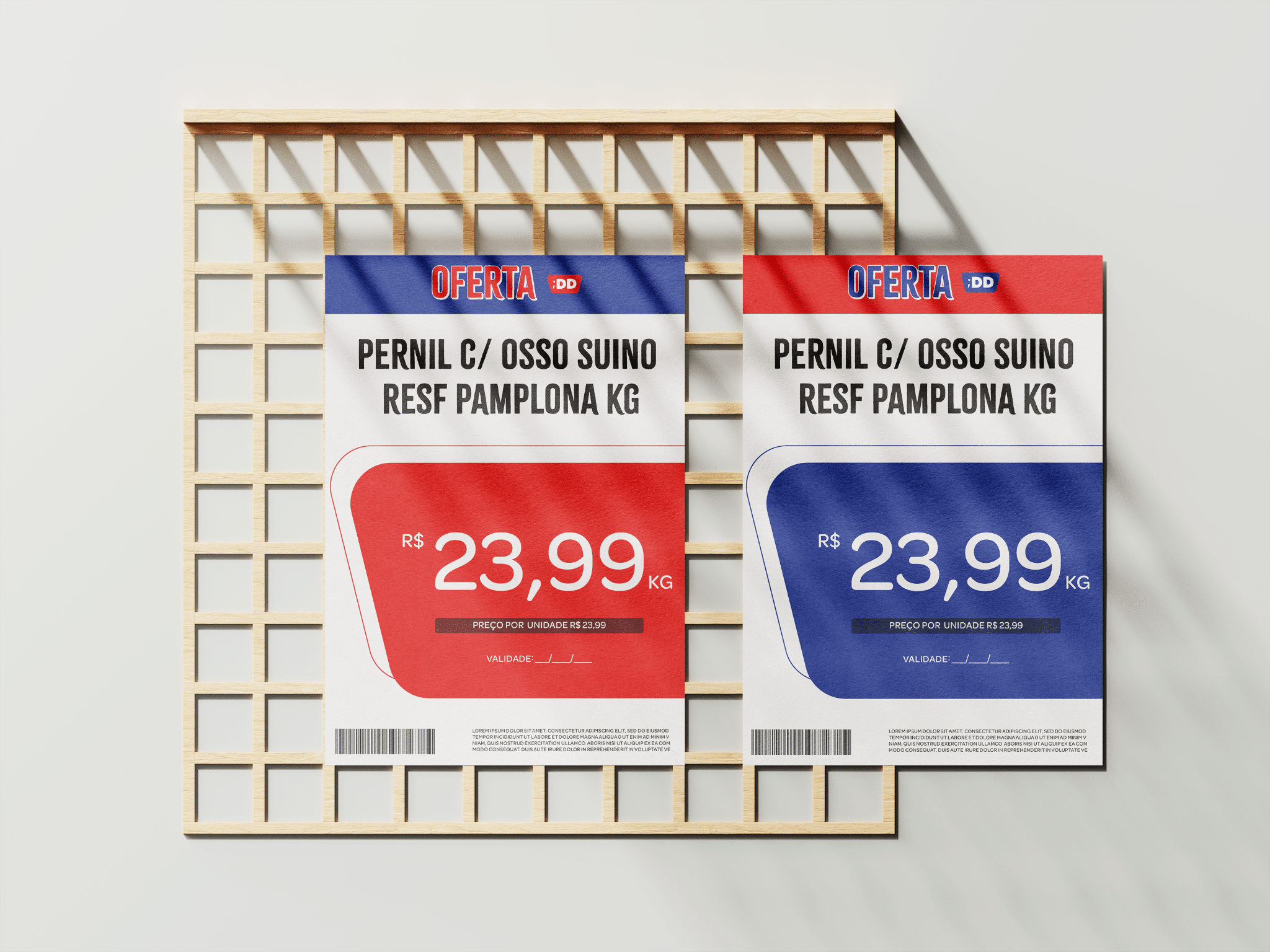
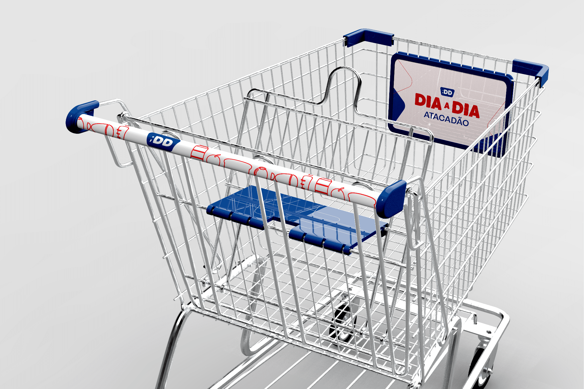
The execution of the new strategy involved intense rebranding work, starting with the logo update that began with a technical correction of the logo and culminated in a more modern and user-friendly version, maintaining the public's visual memory.
In addition, the color palette was reinforced, highlighting tones that associated sophistication with the concept of cash and carry The symbol of the shopping cart has been restyled in a more minimalist and symmetrical way, to convey modernity and ensure better applicability.
Wordmark typography has been refined, maintaining simplicity and adjusting the hierarchy between name and tagline, when applied together.
The work of verbal identity was also crucial, with the development of slogans that captured the essence of the brand in a more emotional way, such as "Your routine is to buy well" and "Come live and buy well".
These changes, which included reinforcing more optimistic and energetic communication, were directly related to the objective of making Dia a Dia a close and welcoming brand, in addition to ensuring a pleasant and effective shopping experience.